Summer Feature Roundup – 6 New Updates for a Smoother Editor Experience
The sun is out, the weather’s warm, and we’re building stuff! In this article we’ll share six new builder features that can benefit you in creating icon consistency in your design, reducing stress when restoring site backups, building more powerful Media Sliders and much more. Read on to discover all the new builder features we’ve rolled out during the sunny season.
New
Add Page Interface
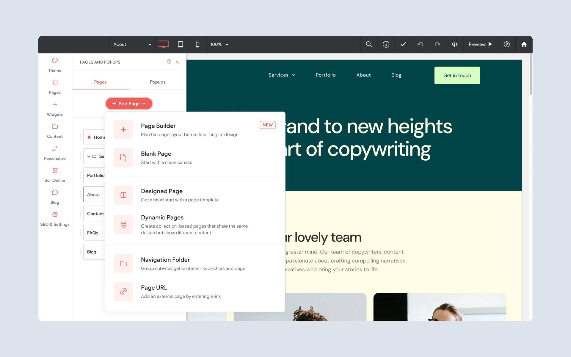
For fans of clear and concise organization, we think you’ll love the new Add Page menu. In the old menu, more and more page types were added as they became available over time, and the choices became a bit overwhelming while the look was cluttered.
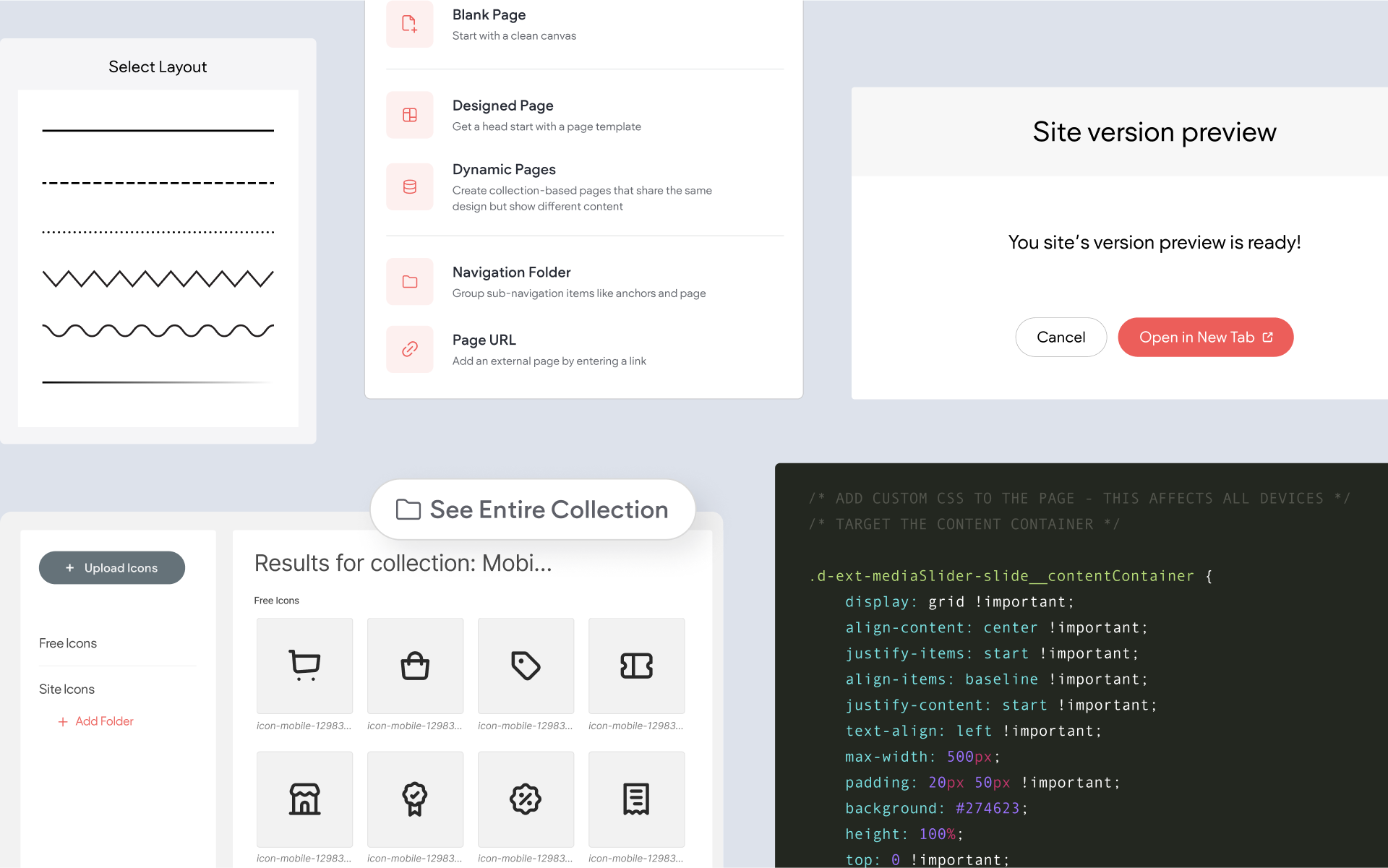
In the new Add Page menu, a quick-opening dropdown gives a concise set of choices, with category-based selections offering a secondary set of options when clicked. For example, if you want to start with a blank page, the
Blank Page option will get you going with a blank canvas straight away; but if you want to see options for a pre-designed page, selecting
Designed Page will open a new window with a variety of choices such as Portfolio, Contact Us and Landing Page.
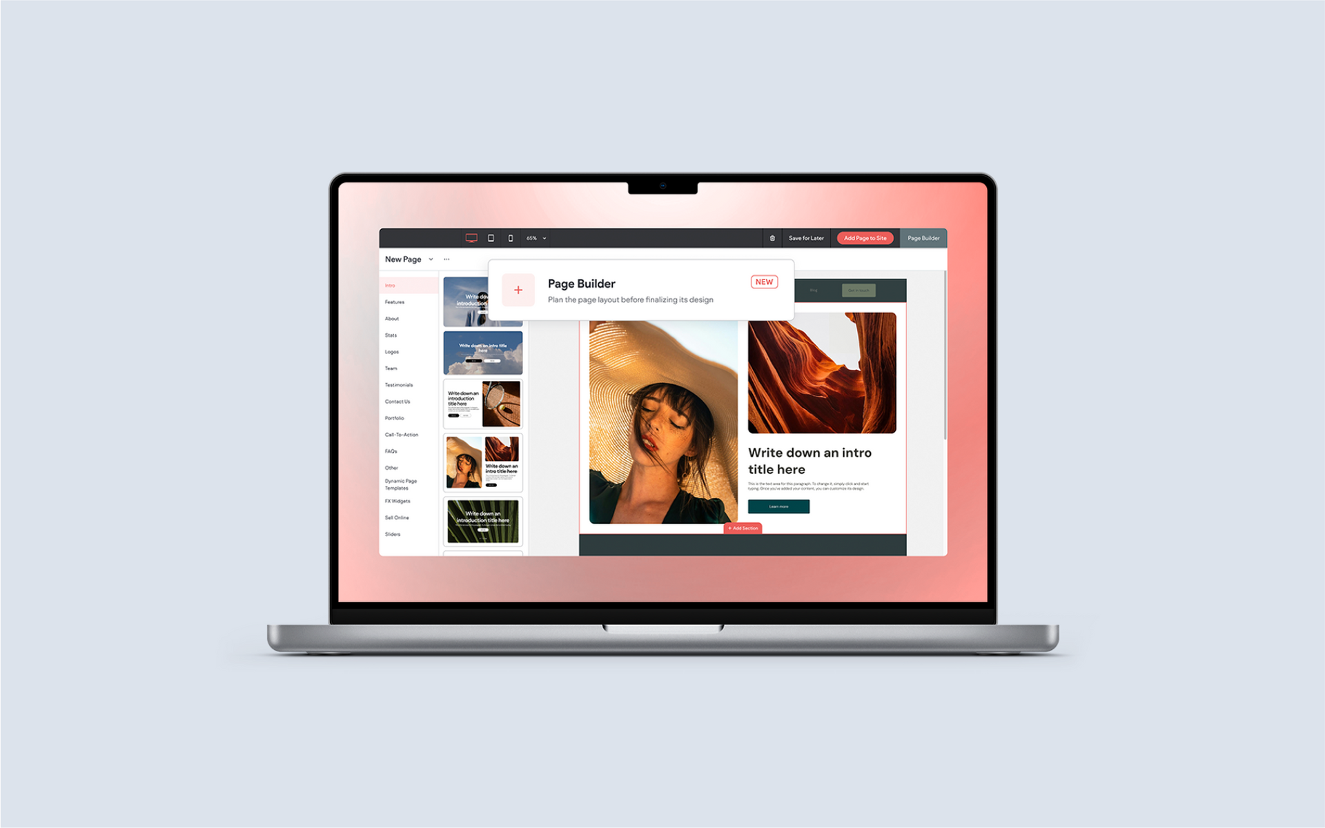
And speaking of page options, the Add Page dropdown is also where you will find one of our most exciting new features: Page Builder. Page Builder is a tool that allows you to mock up pages as fast as you can imagine them. Read our in-depth article about page builder
here.
To Use:
Open the Pages menu, then click Add Page. The Add Page menu shows a mix of options with category-based selections offering additional choices in a new window.
Explore Similarly-Styled Icons Using Collections
Have you noticed how vastly different icon styling can be, as you’re searching for a specific icon for your site? And to make matters worse, using mismatched icons across your site creates a styling nightmare; with inconsistent strokes and fills subconsciously souring the user experience on your site. Our latest Media Manager feature aims to help you avoid all that.
A very unassuming new option can be seen when you click on any icon in your Icon Manager: See Entire Collection. Just as advertised, this option opens the entire collection that the icon came from. And within that collection, you’ll find consistently styled icons across a variety of subjects.
Consider using a single icon collection across your entire site for the best possible consistency.
To Use:
Click on Content in the side menu, then select Media Manager. Click on the Icons tab at the top to open the Icon Manager. Select any icon, then locate the “See Entire Collection” button in the info panel on the right.
Preview & Restore Backup Versions of Your Site
If you’ve ever found the process of restoring backups to be a bit stressful, we’re here to help. We’ve added the option to preview a site backup before restoring it. By previewing, you can now restore with confidence!
This update gives a new level of insight and additional security for you and your subusers. Previously, it was only the date and the name you gave a backup that could be used to inform your selection. This often leads to guessing at which backup version to restore (and then realizing you chose the wrong one, after the fact).
When you preview a site backup, you’ll be able to review a fully functional version of that backup in a new browser tab. With this level of detail, you will have much more certainty in your restore decisions.
To Use:
Click on SEO & Settings in the side menu, then select Site Backup. Click on the preview link for any backup in order to view that version in a new tab.
6 New Divider Styles
Like so much in web design, divider styles can become dated in a hurry (just look at a site from 5 years ago). We’ve freshened up the Divider widget with 6 modern and stylish new styles, including dots, dashes, curves and more. These new styles will liven up your site and provide even more design versatility!
To Use:
Drop a Divider widget on your site. Open the Layout menu to view the new options.
Customizable CSS for Media Slider
If you’re CSS-savvy, this one’s for you. We’ve added standardized CSS classes to several different elements in the Media Slider widget, giving you a nearly infinite number of ways to customize the widget’s design and the elements it includes.
The additional classes follow the popular Block Element Modifier (BEM) front-end methodology, and give you and your team design freedom on a super-granular level. You can also be assured that any CSS customizations you make to Media Sliders in your sites will be maintained, even if we update this widget in the future – so you can customize with confidence.
Here are the CSS classes we’ve added:
.d-ext-mediaSlider-slidesContainer
.d-ext-mediaSlider-slide__contentContainer
.d-ext-mediaSlider-contentContainer__title
.d-ext-mediaSlider-contentContainer__description
.d-ext-mediaSlider-contentContainer__button
.d-ext-mediaSlider-slidesContainer__slide
.d-ext-mediaSlider-slidesContainer__slide--active
To Use:
With Media Slider selected, open Dev Mode and enter the CSS classes you want to apply and customize. Also, remember that you can always preview your changes before making them live. See this quick demo as an example:
Better Scaling Behavior For Buttons
Buttons now scale proportionally, with the button height staying relative to the text height. Or put another way – if you’ve ever been frustrated with scaling buttons, it works much better now. Resizing buttons is now a seamless process (including width and height) and you can avoid correcting button sizing with custom CSS if that’s something you’ve ever had to do.
Note: this applies to newly added buttons only.
To Use:
Drop a new Button widget on your site, and resize as needed.
Moved "Add Site Language" Option to SEO & Settings
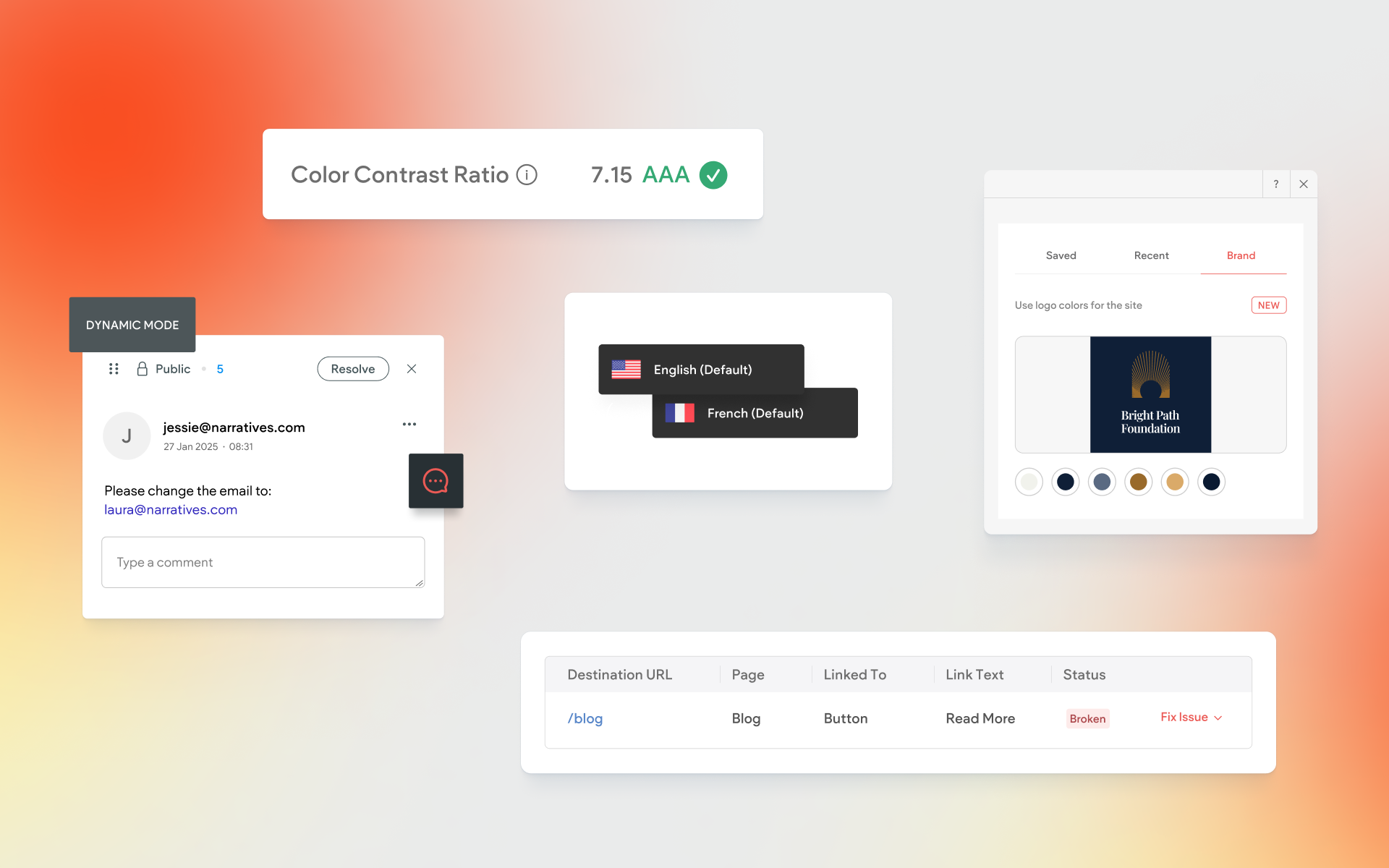
While this one is technically not a new feature-add, it’s worth making note of. If you routinely create sites with multiple languages, you’ll find the Add Language option in a new place. Instead of opening the Pages menu to add a new language, look in SEO & Settings. The Add Language option has its own place in the Site Languages area of your site settings.
To Use:
Open SEO & Settings, then click Site Languages. Locate the Add Language button.
That's It (for the Moment...)
Thanks for reading all about what's new in the builder! As for what's next, we're busy working on some exciting large-scale builder features that will help you manage members, build more stylish stores, and integrate with more third-party platforms. Stay tuned!

