ADA Compliance
Disclaimer
Content presented on this page is for informational purposes only and should not be taken as legal advice. The ADA and WCAG are complex and this list of recommendations should not be taken as complete.
If ADA compliance is important for your website, then it is your responsibility as the designer to ensure your site has been designed in a compliant manner. The Without Code builder can be used to make ADA compliant sites, however, we do not guarantee automatic ADA compliance.
To ensure your site is compliant, we recommend consulting a lawyer or ADA specialist to review your website and make required adjustments.
Accessibility and the ADA
The Americans with Disabilities Act (ADA) was instituted in 1990 to end discrimination based on differing abilities and prohibits discrimination against individuals with disabilities in all areas of public life. Organizations open to the general public must provide “reasonable accommodation” to ensure that people with disabilities have the same rights, opportunity, and access as everyone else.
Accessibility and the Web
Although the first version of the Act primarily addressed physical spaces, the Act requires that every owner of a “place of public accommodation” provide reasonable accommodation to visitors; websites may fall under this umbrella.
The growing digital world has meant that websites are being put under the microscope for accessibility at an increasing rate, although it remains an extremely grey area. Some legal cases have concluded that websites are indeed public places subject to the ADA, some suggest the requirement would only apply to a website that is tied to a physical location (e.g. a clothing store site), and some say there are no strict requirements to define accessibility. As of right now, ADA compliance is not legally mandatory on any website except government-managed sites.
Despite the lack of mandatory compliance, however, the general consensus is that websites should ensure they meet accessibility requirements. First of all, sites not meeting suggestions run the risk of possible lawsuit as this area becomes more well-known, and second of all, providing accessibility to every single individual possible ensures more people can get information they need.
Accessibility and the WCAG
As accessibility requirements and the web are still being established, there is no defined enforceable legislation. The best accepted list of recommendations can be found in the Web Content Accessibility Guidelines (WCAG), which have been guiding the European Union since 1999.
The WCAG defines three levels of conformance for websites:
- Level A – include the most urgent issues that can severely limit a user’s ability to use the site.
- Level AA – may include issues rooted in functionality and areas can be improved to give users with disabilities the full experience.
- Level AAA – this is the highest standard, and only includes minor suggestions.
Most commercial websites aim for Level AA in their efforts to improve accessibility.
The WCAG places accessibility into four categories:
- Perceivable issues – issues that affect a user’s ability to find and understand content on the website. An example would be having an audio-only file, which would affect anyone who is deaf or hard of hearing.
- Operable issues – issues that affect a user’s ability to navigate the website. For example, if the site cannot be navigated via keyboard-only commands, which affects users unable to use a touchscreen or mouse.
- Understandable issues – issues that affect a user’s ability to comprehend all of the information. An example of this would be a confusing error message that a user is unable to understand clearly and therefore unable to correct.
- Robust issues – issues regarding the website’s ability to meet the changing needs of user’s with disabilities. An example would be if the site isn’t compatible with the most popular screen readers.
A list of recommended requirements is provided by the WCAG; these include both design components, as well as more technical (code) requirements. We’ve laid out many of the most notable suggestions for commercial websites below, and while this is not comprehensive, this list does include many of the areas where websites have received complaints in the past.
Design Requirements
Logical Features
Your website should function in a logical way and be easy to understand. This may include providing clear instructions for all forms or putting a clear “x” in the corner of a popup that shows users how to close it.
Documents
Ensure that all documents on your website can be read by an assistive reader. This means providing a text-based format, such as rich text format, as image-based formats like PDF can’t always be understood by assistive readers.
Forms
If you include forms on your website, ensure that each default setting includes a description of the section, rather than one of the response options (e.g. “your gender” instead of “female”).
Video
You must provide audio descriptions for all video to convey information for those that are blind or visually impaired. As well, ensure videos include written captions throughout the video for those that are deaf or hard of hearing.
Tip: If you are using YouTube or Vimeo, you can add synchronized captions or upload a captions file.
Audio
Ensure all of your audio tracks include written captions or a transcript for those who are deaf or hard of hearing to understand what information is conveyed.
Graphics
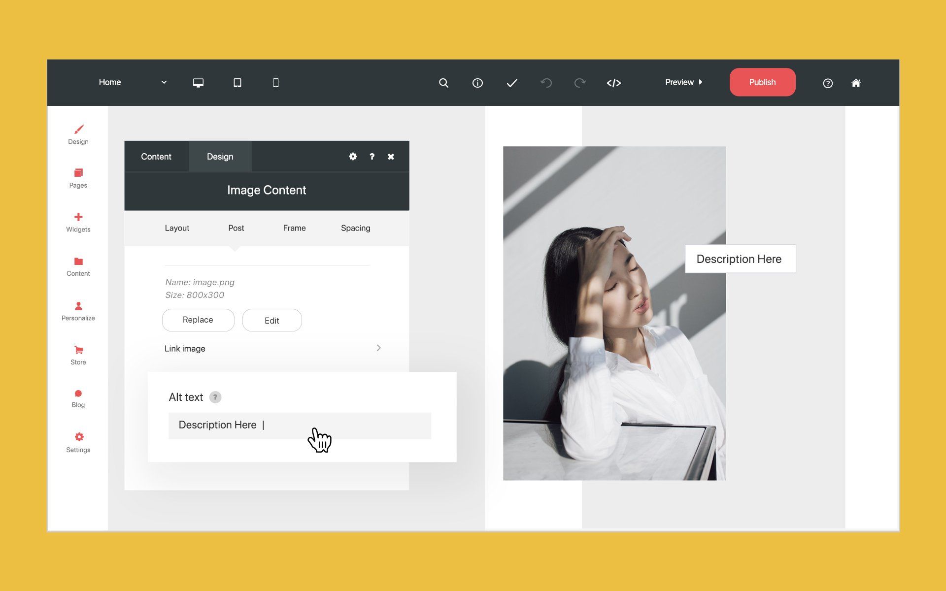
Consider avoiding using images to display pertinent information, opting instead to write information out. If you do use images, ensure that images include a caption and a description that can be read by a screen reader.
Choose graphics that do not flash more than three times per second; this will ensure graphics are not a risk to those who experience seizures.
Text - Fonts
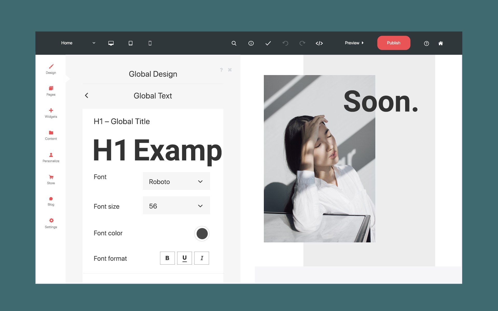
Easy-to-read fonts should be used throughout your site and in particular for body text. A few examples are Roboto, Open Sans, and Lato, but there are several good options for fonts that will make reading your site easier for those who are visually impaired.
Text - Contrast
Ensure you use a background and text color with enough contrast that it can be easily read. For example, avoid using a light-colored font on a light background, as someone who is visually impaired may have difficulty reading this.
Text - Headings
Headings can help users with screen readers navigate content more quickly. Set up large headlines to draw attention to major sections and smaller headings for sub-sections.
Tip: Use the Global Text settings to define various heading sizes; this can speed up the process of creating heading types.
Links
“Skip navigation” Link
Policy
Technical Requirements
Navigation
Text
Graphics
Forms
Data Charts/Tables
Recommendations
Review and Update
Establish a Process
- Adding an accessibility policy to your website
- Establishing a process for reviewing and adding new content
- Briefing all team members on the step by step process


