Spring Feature Roundup – 5 New Updates to Level-Up Your Site Designs
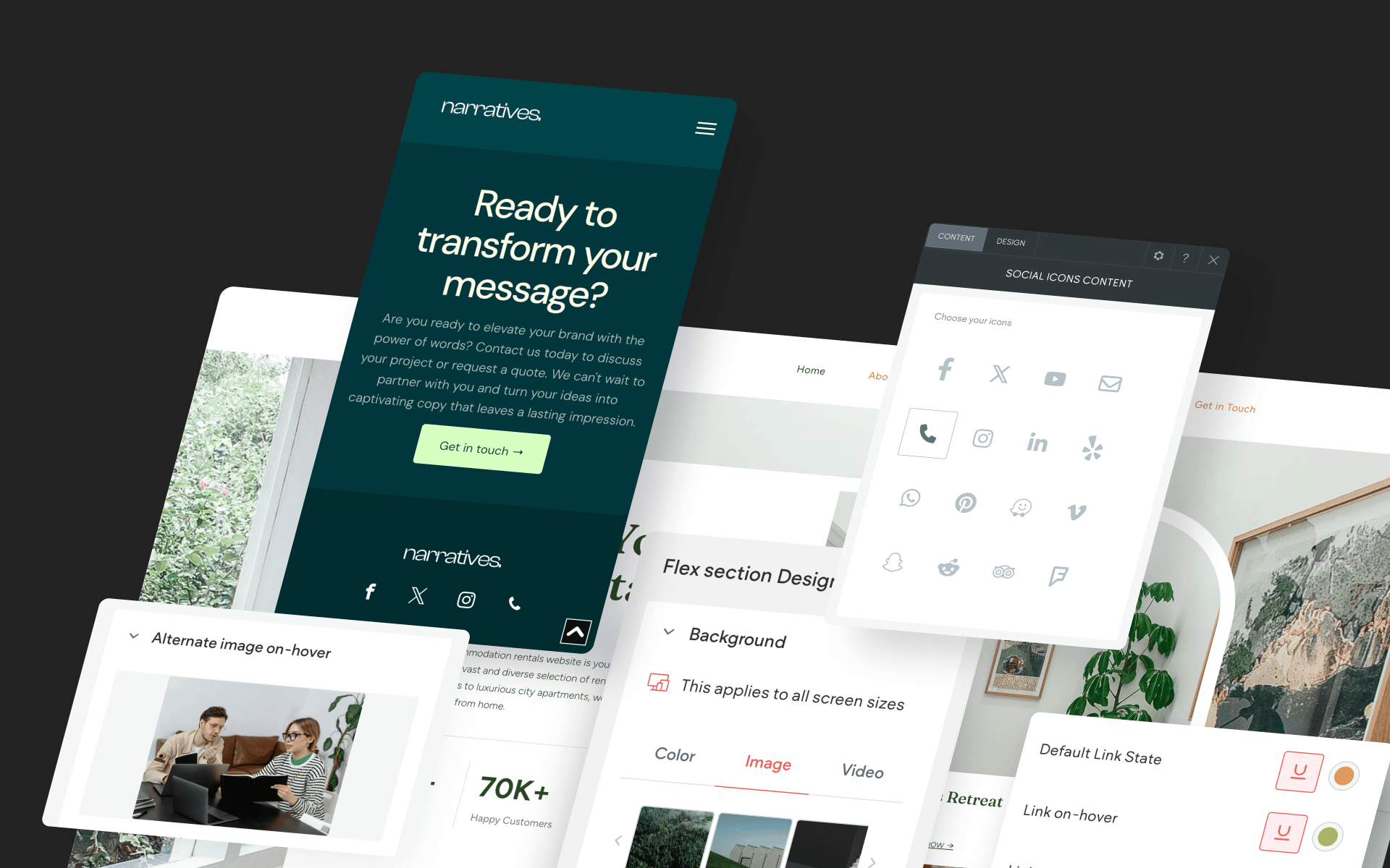
Spring has sprung! And just as this is a great time for a bit of Spring cleaning, we thought it would be the perfect time to report on a roundup of features that have been newly added to the Without Code site editor.
Included in the updates are improvements to global styling, a great new feature for mobile sites, a Flex update and a cool new function for a classic widget. Read on to learn details, see how to use these features and view a short demonstration video.
Display an Alternate Image On Hover
Our first feature adds clever functionality to a core widget: the Image widget. You can now choose a secondary image to appear on hover. This simple effect can be extremely effective for showing an alternate product image, a different angle of the same photo subject, a color variation and much more.
On-hover image changes create a clean and non-intrusive way to add content variation that your customers will love!
To Use:
Place an Image widget on your site and select an image. Locate the “Alternate image on-hover” setting at the bottom of the widget option panel and select your alternate image. For best results, use an alternate image with the same aspect ratio (shape) as the main image.
Click to Call Icon
Click-to-call is a highly useful function that has been improving mobile sites since the earliest days when users first began visiting websites on mobile devices. And now that more people visit websites on mobile than any other device, this feature is more valuable than ever.
The click to call icon is now available in the Social Icons widget.
To Use:
Place the Social Icons widget on your site where you’d like the click to call icon to be seen. Be sure to enter the phone number at the bottom of the content panel.
Improved Corner Radius
Did you know you can adjust any corner radius separately (top left / top right / bottom left / bottom right)? While this has been possible for quite a while, we’ve added a dropdown that allows for a new radius style: percentage-based. Percentage-based radii are calculated differently from pixel-based radii, as they are calculated based on the entire object shape. Therefore, percentage-based radii will offer different radius shapes depending on the shape of the element.
Consider leveraging corner radius adjustments to create dramatic styling in your site, such as a maxed-out corner radius on just one corner of an image. Using this technique consistently on a site can create its own unique aesthetic across an entire site! Corner radius is available on most elements, including things you may not have thought of, like galleries, rows and columns.
To Use:
In the Design tab, locate the Corner Radius option. Click the gear icon to select all corners, individual corners or a combination of individual corners. To choose between pixel-based and percentage-based, click the “px” box next to the numerical value. This will display a dropdown, allowing you to select your method of choice.
Global Styling for On-Hover & Clicked Text Links
Do you utilize the “Theme” section for setting global styling across your site? This is a massively efficient way of making instant styling updates across the site all at once. Setting global styles also creates a highly consistent site experience for visitors.
We’ve added two new global style controls for text: Link on hover & Link clicked.
To Use:
Click “Theme” in the side menu. Click “Text” to open up all styling attributes (including Link on hover & Link clicked)
Convert Sections and Columns Into Image Sliders (Flex)
You can now add more than one background image in a Flex section in order to create an instant image slider. Image sliders as backgrounds are subtle and transition images automatically. Use this feature to expose your best media content and drive customer actions.
To Use:
In Flex mode, apply a background image to a section. Then click the “Create background slider” button and add the additional images for the slider.

