Without Code Website Rebuild - Behind the Scenes
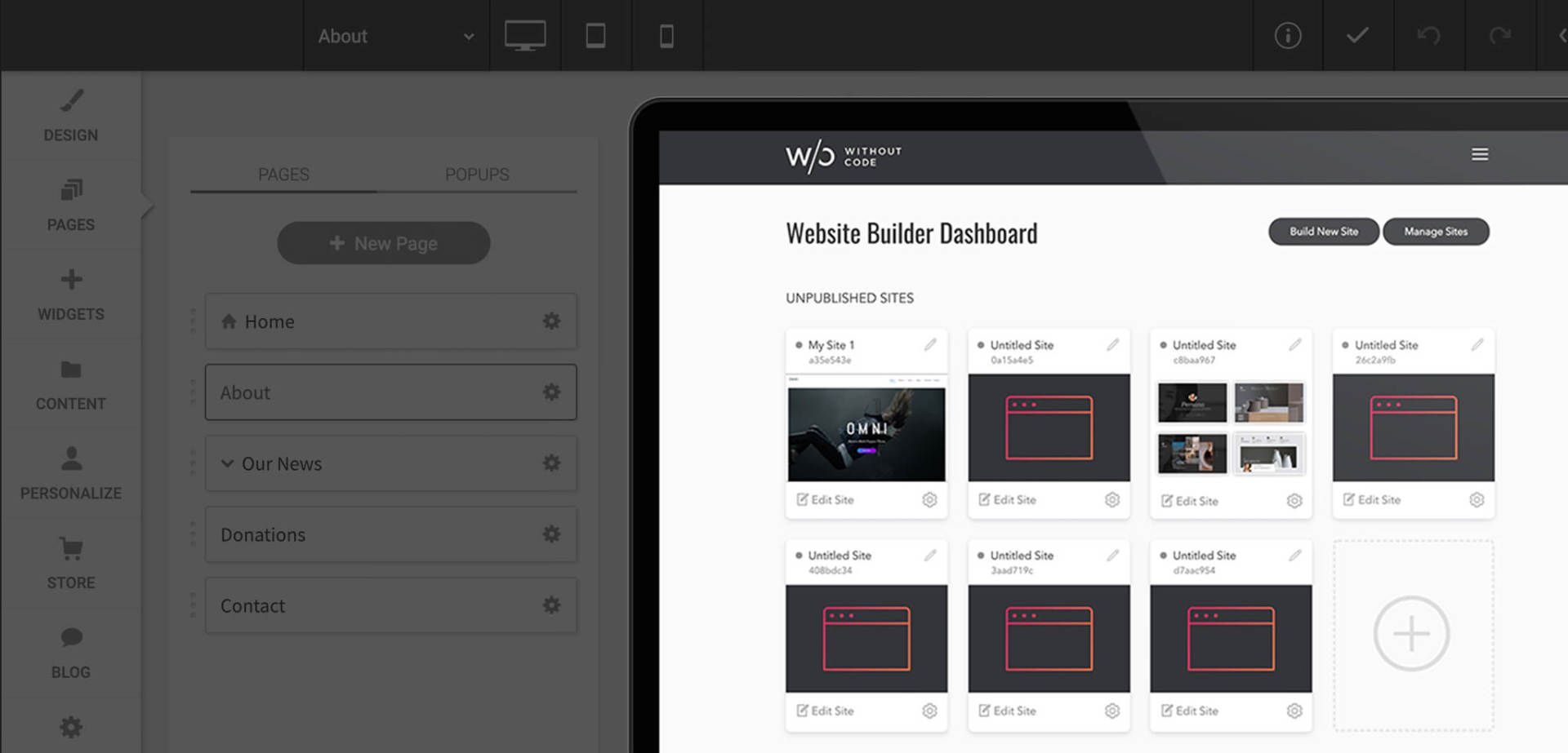
You've probably noticed by now that our website and customer dashboard has been completely redesigned! It was re-built from the ground up to improve performance and lay the foundation for future awesome.
This was a massive project for our team, and I wanted to share some insight into why this change was made and how it benefits our users. I'll also include some important tips you should follow when relaunching any established website.
A Fresh Start
Our first iteration of the Without Code website was built entirely on WordPress. Unfortunately, due to the complexity of our site and database requirements we couldn't build the site on our own platform. We chose WordPress for its usual selling point – it had established plugins that we could integrate quickly. We thought it would save us time...
Well, it didn't.
In fact, it cost us major time and effort to clean up slow / bulky code, patch holes and design all of our pages from scratch. We even tried starting with a popular theme, but ended up ditching it because it was so bloated with junk.
Making a simple site update was cumbersome, and every feature I wanted to integrate required a plugin from a developer that I didn't know or trust. We even moved hosting providers twice because our WordPress admin / database was so painfully slow. All this and I’ve got an entire in-house development team at my disposal!
In the end I just wanted what our members had – a quick “visual” page builder, lean / optimized code, snappy load times and no ongoing maintenance or security concerns (a worry-free solution).
I was jealous of our own customers!
Never Again WordPress
As a new business we needed our website to be nimble, allowing us to pivot quickly, build new pages fast and regularly tweak content to better communicate with customers. WordPress had become a barrier for our business.
So, we decided to rebuild the entire site on Without Code and split out our app / database components into a completely different location. That explains why you're now seeing app.wocode.com
in the browser for our customer dashboard.
And after a long, late and at times, stressful night during the first week of the new year, we successfully swapped the site.
We’re already seeing benefits from the relaunch. Our SEO has improved, and search rankings increased (within days). Our entire team is now able to pop into our site using the CMS and make updates or fix a broken link easily. And most importantly, both the core site and app / dashboard are much faster, with a measured improvement of over 800x!
Without Code: Now Built on Without Code!
I'm proud to say our site is now built and hosted on the same platform and network as our customers. If you're encountering an issue, we're going to encounter it too. If we develop a cool feature for our own site, we can make it available to our members too. We’re in this together!
During the rebuild I also kept track of any techniques (and hacks) I used or discovered that I can share in tutorial videos.
I'm aware it might seem silly to celebrate using your own product, however, I think people overestimate how many companies live and breathe their own products every single day. It's easy to become disconnected from your own platform (and eventually the needs of the market) because you've become a business owner, no longer a user.
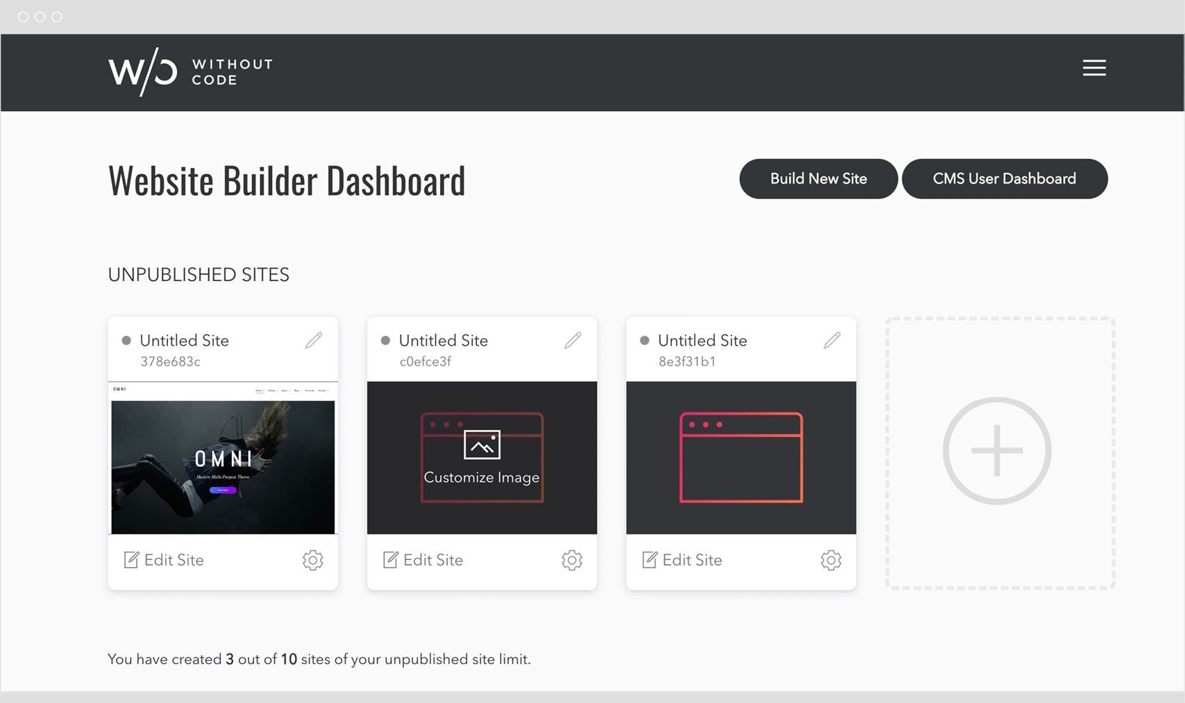
Redesigned Customer Dashboard
We took this split-up situation as an opportunity to redesign our customer dashboard and follow modern interface design techniques. Our old dashboard displayed an excel-like table full of numbers and text; other than a nickname, it was hard to tell which site was which.
The new dashboard uses individual "cards" for each site, combining commonly used options into a pop-up modal. Unpublished and published sites are now grouped together for logical separation and designers can upload a custom thumbnail image for each site, making it quick / easy to identify the site you want to edit.
The dashboard also works harder behind the scenes to pre-load sites and assets, which improves the launch speed of the editor and avoids any caching issues or cookie timeouts.
Lastly, this new dashboard gives us a foundation that we can constantly tweak and improve on. We're already working on the next iteration, which we hope will include the ability to sort sites, group / create folders, and search within your account. None of this would have been possible on our old setup.
Relaunching a Website – Important Tips
As exciting as this rebuild was for our team, we did have concerns about losing search rankings. When your website is already established and performing well in search, a complete rebuild can result in a ranking drop if not approached carefully.
Here's how we gracefully transitioned the site and maintained our high rankings:
Install a Keyword Monitoring Tool
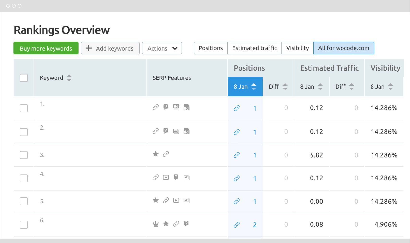
A few weeks before our relaunch I installed a tool we used heavily at MuseThemes called SEMRush.
This software will monitor your search rankings for any keyword you specify, and alert you of any major changes. It also runs audits on your site looking for issues, such as broken links or missing pages.
By installing this tool ahead of time, I had a good base of data to compare against after the relaunch. It would be easy to see if our rankings had dropped, and SEMRush would even give us some explanation as to where we messed up.
SEMRush is a premium paid service, however, there are a variety of similar options out there (check out this post for some ideas).
Use Identical Page URLs (if possible)
If Google has already indexed and ranked a page on your old site, it's ideal to ensure the new version of that page exists at the exact
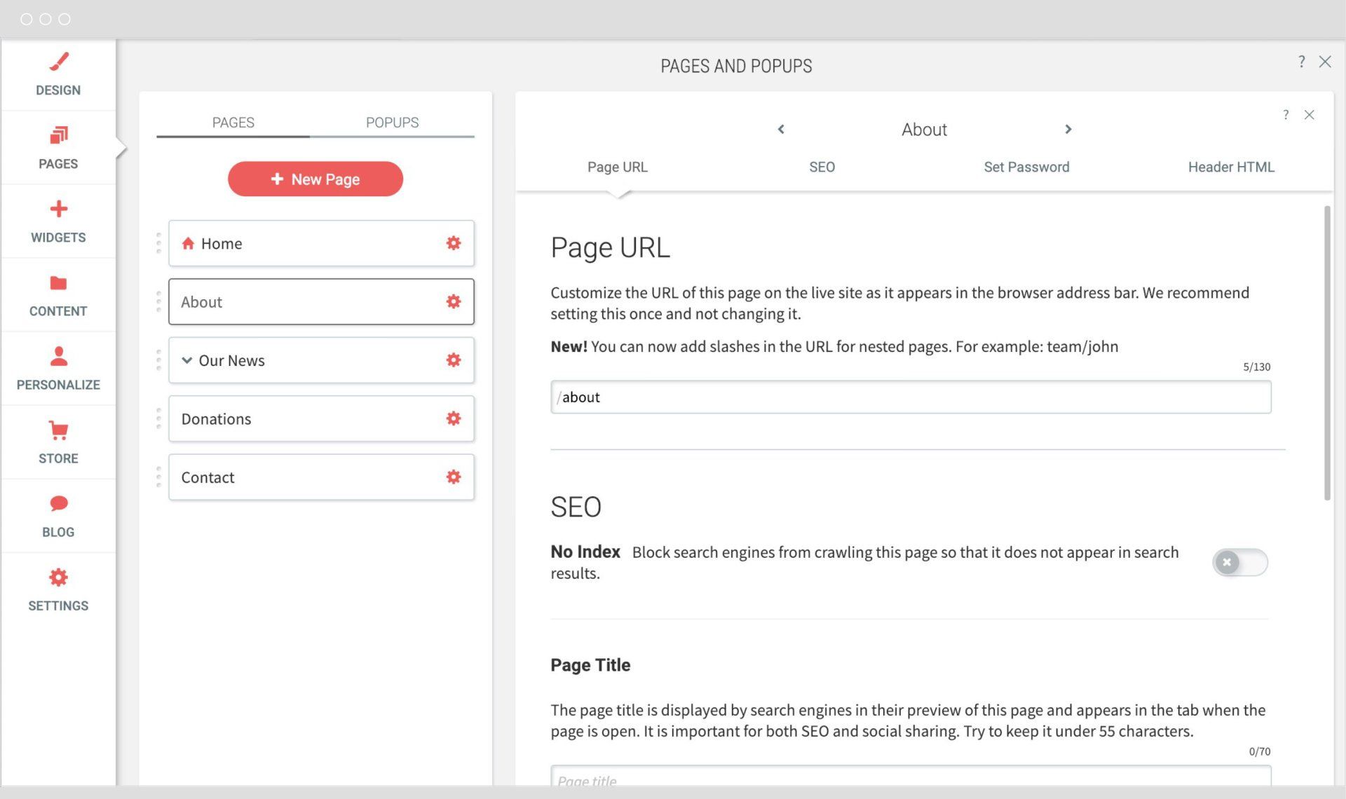
same URL. Since you can easily modify the URL of any page in our editor (within the Page Settings option), I recommend making a big list of all the URLs on your old site and matching them carefully to the appropriate pages on your new site.
Our editor even allows you to generate deep URLS (links in subfolders), so it's rare you won't be able to match up your old site URLs exactly.
Set-up URL Redirects
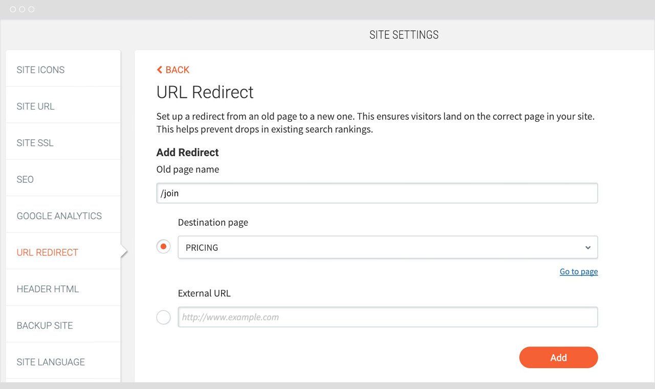
If you absolutely can't use the same page URL, you need to tell Google where the new page is going to live. Officially called a "301 redirect," it's used when the page has permanently moved.
For the wocode.com
site, we needed to redirect most of our documentation links to the new domain (app.wocode.com). Our redirects look like this:
Now if a user or search engine follows the old page URL, they are automatically redirected to the new location. Perfect!
Integrate Portable Systems
Our original site contained tons of blog comments that sadly, we had to leave behind. The commenting system originally used was built into WordPress and can't be moved to a new platform.
This left me thinking about the importance of integrating features in a portable way. For example, we are now using Disqus to power our blog comments. Any comment posted will now live on the Disqus side, and we can take them with us and embed them anywhere we need in the future.
While third party products and embeds are often a last resort, sometimes they pay off in the long run when it comes time to make a change. Lesson learned!
Resist the Urge to Change Everything
As we redesigned the site, it was tempting to go big and rewrite all of the text and headlines. But this is risky because you're already changing so much, including the format of the site (the code) and potentially even the page URLs. In my opinion, it's better to keep some
of your old content intact, just in case that content is a major driver of your search rankings.
After the relaunch, you can begin to freshen up your content and monitor your rankings throughout the process. Google doesn't mind major changes, but you need to make it easy for her to remember who you were originally...
These are the main steps we took during our relaunch, and our keyword monitoring shows no drop in any of our key rankings. In fact, our new site is performing better on Google than ever before, and I attribute this to the extensive SEO and code optimization built directly into the platform.
Thanks for nothing WordPress – good riddance!
I hope you enjoy the new site and dashboard. Let's make 2019 an epic year and build tons of lightning fast / headache-free sites together.
Cheers!
Steve Harris

